rachael.gittins@gmail.com
May 23, 2011
Cabinet
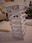
My work for the degree show is to go in the cabinets in the Holden Gallery. Now I know this I am going to revert back to the idea of a museum, and try and push that aesthetic concept as far as I can. In the gallery are images of the cabinets and work, where I was testing out scale. I thought I would have to resize everything, but actually like the feel that miniatures have in the space.


May 15, 2011
Petrichor
Just some quick experiments with different geometric shapes. I wanted to see what would happen if I changed the basic shape into something more complicated, and whether it would be more effective. Once I’d made a few I then started cutting into them, but that proved not only incredibly complicated, but also really weakened the shape, to the point where it had no rigidity. Like with the metal, it has made me have faith in my original design, and to keep it simple, rather than over complicate everything.
May 14, 2011
Aeipathy Slides
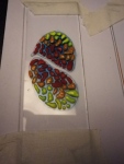
My idea for the aeipathy artifact was to paint the cell design I have been playing with onto microscope slides, to further enhance the idea of it being medical or scientific. This way, they would look like they had been drawn out of each victim and placing onto the slide for further inspection. Each slide would be accompanied by a small note about who it was drawn from, like a mini medical record, their characteristics, the effects of the disease etc.
I am pleased with how they look, particularly the ones that are more raised.


May 6, 2011
Petrichor
Gone back to paper. The main feature I have added would be to make the lines curved rather than straight, so that they resemble a rib cage more. I think it’s quite effective. I also played around with cutting the middle strip out of some of them, but I quite like the strip becuase of its connotations with the spine. I’m also looking at ways of scaling them up, but need a bigger compass to do that….


May 3, 2011
Petrichor
I decieded to experiment with making the Petrichor machine out of metal. I was worried that it being made out of paper would in some make the design seem less pertinent, or give it less creed. By using sheet metal I had hoped to overcome this. Whilst being excited and suprised by how easy the sheet metal was to work with I was not happy with the results. It did not fold well or hold its shape at all. This has lead me to get over the idea of paper being a substandard medium, and embrace what I am able to do with it.


April 29, 2011
Brilliant lecture
David McCandless is a designer/journalist worked with the visualization of data. This is a TED lecture he did last year. I found the concept of infographics simultaneously moving across two languages; the eye and the word, particualrly interesting, it is not something I had considered before. I guess that in order to make it a successful piece of design you must not only make it aesthetically engaging, but the information contained within must be interesting enough to justify the audience’s time.
http://www.ted.com/talks/lang/eng/david_mccandless_the_beauty_of_data_visualization.html
April 29, 2011
Projection
http://journal.benbashford.com/post/4530562245
Here, the (simple) data is displayed through projection around the given object. I like the idea of projecting around, it seems to breed an intimacy between the object and the data, rather than them being two separate entities. This idea of projecting data could be interesting, perhaps I could project mine, rather than have them as physical posters. This would also save space…
April 27, 2011
Diagrams
Here are some of the diagrams I have been working on recently, inspired by the work of Nicholas Feltron. I originally played around with the idea of using a blue print aesthetic, but discovered that that wouldn’t allow me the space to put down all the information that I needed. Having adequate space is important, since the objects themselves have very little context without the inclusion of the stories behind them.
These diagrams then, will showcase some of the ideas behind each object, as well as be an exercise in design. In terms of presentation, I am currently colouring them all differently, the idea being that each plinth will be a different colour, and the two will link together that way rather than any messy arrows etc.
I am particularly interested in the idea of working a more personal relationship into these diagrams, showing how the imaginary inventor’s life fits into it all, rather than them just being stationary objects. I think this will make it much more engaging for the viewer.
The purple ones follow airgonaut, an imaginary around the world trip that the inventor takes in a flying machine of her own design, and the red one is aeipathy, a drug that she invents that gets picked up by the military for use in warfare (it increases the passion levels in the takers, thus making them more aggressive soldiers).
April 20, 2011
Nicholas Felton
Felton produces yearly ‘reports’, in which he collects together various data about the previous year; one, for example, is collected from all the conversations he had that he deemed ‘meaningful’. These are then collated into minimalist, but very precise and dense graphs, diagrams and typography. I was impressed by the way that he manages to make large volumes of sheer information so aesthetic and interesting to look at, particularly since the information he is working with is intentionally banal and everyday.
The piece that interests me the most is his most current; the 2010 Annual Report.
http://feltron.com/ar10_01.html
This seeks to condense his father’s entire life into a 16 page booklet of diagrams and text. The idea of expressing somebody’s life this way fascinates me; by just showing pure, cold fact rather than any sort of emotional reading. It is also impressive how much narrative Felton manages to work into his designs, since information design is generally considered to be quite a clinical, harsh approach to looking at things.
I have been struggling with what to do with the diagrams for my show, because I know that the information that accompanies these objects is going to be vital to the audience understanding the concept as a whole. I think this sort of aesthetic could be an interesting way of expressing such a large volume of information. I also think I need to break it down a bit more, rather than trying to do one piece for each, I need to be unafraid to do lots of posters and then work them into the space. I am also in the process of thinking how the posters fit into the installation- did the inventor do them or did the curator?
